Tracking Covid19 Cases Throughout NJ with R

Introduction
With the ongoing Covid19 pandemic affecting the world, I felt inspired to utilize the vast amount of data we have from it. I came across a dataset by The NY Times that contains time series data on Covid19 cases and deaths in the United States, sourced from state and local governments as well as health departments. You can access the dataset through the hyperlink above. My objective is to use this data to create an animated time series map that shows the spread of Covid19 throughout New Jersey over time.
Read in the data
To read in the data I will use the readr package.
library(readr) #loads package

covid19_data<-read_csv("us_counties.csv") #function that reads in csv files
Now that the data is read in.. lets check the structure of the data
str(covid19_data)## spc_tbl_ [61,971 × 6] (S3: spec_tbl_df/tbl_df/tbl/data.frame)
## $ date : Date[1:61971], format: "2020-01-21" "2020-01-22" ...
## $ county: chr [1:61971] "Snohomish" "Snohomish" "Snohomish" "Cook" ...
## $ state : chr [1:61971] "Washington" "Washington" "Washington" "Illinois" ...
## $ fips : chr [1:61971] "53061" "53061" "53061" "17031" ...
## $ cases : num [1:61971] 1 1 1 1 1 1 1 1 1 1 ...
## $ deaths: num [1:61971] 0 0 0 0 0 0 0 0 0 0 ...
## - attr(*, "spec")=
## .. cols(
## .. date = col_date(format = ""),
## .. county = col_character(),
## .. state = col_character(),
## .. fips = col_character(),
## .. cases = col_double(),
## .. deaths = col_double()
## .. )
## - attr(*, "problems")=<externalptr>Everything seems to look correct. All the columns seem to have the right structure!
Filter data
Being that we only want to see how Covid19 spread in the state of New Jersey, we will filter the dataset to only show cases that occurred within the state. This can be achieved using the dplyr package, which provides a convenient way to filter, manipulate, and summarize data in R. However, the dataset also contains a significant number of cases that are labeled as ‘Unknown.’ These cases are reported separately by state health departments when the patient’s county of residence is unknown or pending determination. Since we are interested in analyzing the spread of Covid19 at the county level, we will remove these cases as we cannot link them to a specific county.
library(dplyr) # used for data wrangling

NJ_covid19<-covid19_data%>%
  dplyr::filter(state == "New Jersey",county != "Unknown") #filters data frame

head(NJ_covid19) # Returns the first or last parts of the data frame
## # A tibble: 6 × 6
## date county state fips cases deaths
## <date> <chr> <chr> <chr> <dbl> <dbl>
## 1 2020-03-04 Bergen New Jersey 34003 1 0
## 2 2020-03-05 Bergen New Jersey 34003 2 0
## 3 2020-03-06 Bergen New Jersey 34003 3 0
## 4 2020-03-06 Camden New Jersey 34007 1 0
## 5 2020-03-07 Bergen New Jersey 34003 3 0
## 6 2020-03-07 Camden New Jersey 34007 1 0Obtain county shapefile
Since the data frame does not contain any geographic information such as boundaries or polygons, I need to download a shapefile of New Jersey’s counties to join to the NJ_covid19 data frame. Luckily, the New Jersey Office of GIS has a great website to download hundreds of spatial datasets across the state. You can find the website here. By going to this website, I can download the county shapefile in ESRI shapefile format, which contains boundary information for each of New Jersey’s counties.
Read in county shapefile
I can read in the NJ county shapefile using the sf package, which is an excellent tool for working with spatial data. The sf package provides a wide range of functions and tools for spatial data analysis, including the ability to read and write different spatial data formats, perform geometric operations, and create maps and visualizations.
library(sf)

NJ_counties<-st_read(getwd(),"New_Jersey_Counties") #function to read in shapefile
## Reading layer `New_Jersey_Counties' from data source
## `C:\Users\kzolea\Desktop\personal_website_2022\content\posts\covid19_nj'
## using driver `ESRI Shapefile'
## Simple feature collection with 21 features and 22 fields
## Geometry type: MULTIPOLYGON
## Dimension: XY
## Bounding box: xmin: 193684.7 ymin: 34945.75 xmax: 657059.7 ymax: 919549.4
## Projected CRS: NAD83 / New Jersey (ftUS)As you can see in the screenshot above, the shapefile was successfully read into R. Now let’s plot it to ensure that everything is working correctly.
plot(st_geometry(NJ_counties)) 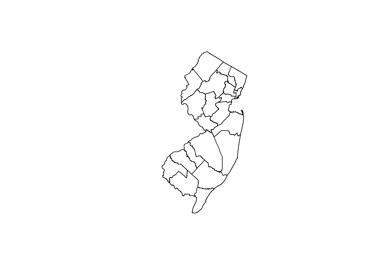
Join shapefile to data frame
To create a map with the original data, we need to join the shapefile (NJ_counties) with the NJ_covid19 data frame using the left_join() function from the dplyr package. This function will join the two datasets based on a common column, which in this case is the county column. First, we need to make the county column header in the NJ_counties dataset lowercase, so we can match it with the NJ_covid19 data frame. Then, we need to make all the counties in the county column lowercase in both datasets to ensure they match. See the code below for the implementation.
names(NJ_counties)<-tolower(names(NJ_counties)) # Makes county column header lowercase

NJ_counties$county<-tolower(NJ_counties$county)#Makes all rows in the county column lowercase

NJ_covid19$county<-tolower(NJ_covid19$county)#Makes all rows in the county column lowercase
Now I can join the two datasets based on the county column in both.
NJ_covid19_shapes<-left_join(NJ_covid19,NJ_counties,by="county")%>%
  dplyr::select(date,county,state,cases,deaths,geometry)#selects only the columns of interest

head(NJ_covid19_shapes)
## # A tibble: 6 × 6
## date county state cases deaths geometry
## <date> <chr> <chr> <dbl> <dbl> <MULTIPOLYGON [US_survey_foot]>
## 1 2020-03-04 bergen New Jersey 1 0 (((656201 783614.4, 656141.1 783413…
## 2 2020-03-05 bergen New Jersey 2 0 (((656201 783614.4, 656141.1 783413…
## 3 2020-03-06 bergen New Jersey 3 0 (((656201 783614.4, 656141.1 783413…
## 4 2020-03-06 camden New Jersey 1 0 (((342764 423475.8, 342804.1 423429…
## 5 2020-03-07 bergen New Jersey 3 0 (((656201 783614.4, 656141.1 783413…
## 6 2020-03-07 camden New Jersey 1 0 (((342764 423475.8, 342804.1 423429…Make map with ggplot2 and gganimate
With the data manipulation complete, it’s time to build the actual map. To create the final animated time series map of how Covid19 spread throughout New Jersey’s counties, I’ll be using the ggplot2 package in conjunction with the gganimate package.
library(ggplot2) #Used for plotting
library(gganimate) #Used for animations
library(RColorBrewer) #Used for color scale

# Used to make new data frame an sf object
# Must use st_as_sf in order to use geom_sf() to plot polygons
NJ_covid19_shapes<-st_as_sf(NJ_covid19_shapes)
# Makes plot with ggplot2 and gganimate to animate through the days
covid_map<-ggplot()+
  geom_sf(data = NJ_counties,fill = "white")+
  geom_sf(data = NJ_covid19_shapes,aes(fill=cases))+
  ggtitle("Spread of COVID-19 Throughout New Jersey")+
  xlab("")+
  ylab("")+
  labs(subtitle = "Date: {current_frame}",
       caption = "Data Source: The New York Times\nAuthor: Kevin Zolea")+
  cowplot::background_grid(major = "none", minor = "none") +
  theme(axis.text.x = element_blank(), axis.ticks.x = element_blank(),
        axis.text.y = element_blank(), axis.ticks.y = element_blank(),
        axis.line = element_blank(),
        legend.background = element_blank(),
        legend.position=c(-0.3,0.8),
        plot.background = element_blank(),
        panel.background = element_blank(),
        legend.text = element_text(size=12),
        legend.title = element_text(colour="black", size=12, face="bold"),
        plot.title=element_text(size=20, face="bold",hjust =0.5),
        plot.subtitle = element_text(hjust = 0.5,size=12),
        plot.caption = element_text(size = 11,
                                    hjust = .5,
                                    color = "black",
                                    face = "bold"))+
  scale_fill_distiller("Number of Positive Cases",
                       palette ="Reds",type = "div",
                       direction = 1)+
  transition_manual(date)

  animate(covid_map, nframe=27,fps = 2, end_pause = 15,height = 500, width =500)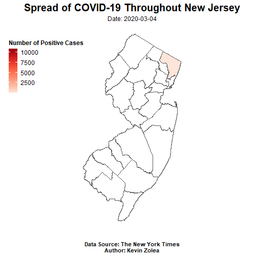
Things to note about above code
Since I merged a non-spatial dataset with a spatial one, I needed to use st_as_sf() to convert it into an sf object for use with the geom_sf() function. While experimenting with the transition_time() function, I found that the polygons on the map moved unpredictably. To solve this, I used transition_manual() instead. With the animate function, I could adjust the speed of the animation, number of frames, height, width, and more. For more information on the gganimate package and ggplot2 package, check out the following resources:
Conclusion
Based on the animated time series map created using the NY Times COVID-19 dataset and NJ Office of GIS county shapefile, it is evident that the majority of positive cases are located in the northern parts of NJ. This pattern is to be expected, given the region’s higher population density and proximity to neighboring state NY, which has been one of the hardest hit states in the US. However, it is also important to note any trends or changes in the data over time and to compare it to other regions or states for a more comprehensive understanding. These findings may have significant implications for public health policies and healthcare resource allocation in NJ and beyond. To learn more about the analysis and methodology used in this project, please refer to the earlier sections of this post.