Exploratory Data Analysis of Fortune 1000 Companies

Introduction to Exploring Fortune 1000 Companies Data using Python
As a data analyst, one of the most important skills you need to have is the ability to work with data to gain insights and answer questions. Recently, my girlfriend started working for a Fortune 1000 company, which sparked my curiosity about the makeup of these companies. In particular, I was interested in the percentage of women who are CEOs, which states have the most Fortune 1000 companies, and the top profitable companies. To answer these questions, I searched for a suitable dataset on Google and found one on Kaggle that had exactly what I was looking for. The dataset contained data for the year 2021, and was scraped from the fortune website by the dataset author.
Before diving into the analysis, let’s discuss the meaning of exploratory data analysis (EDA). EDA is a valuable process used by data scientists and analysts to investigate and analyze datasets. It helps to identify the main characteristics of the data through various visualization techniques.
To begin the analysis, I used Python, along with the Pandas, Seaborn, Squarify, and Matplotlib libraries. Pandas was used to read in the dataset, Seaborn was used for data visualization, Squarify was used to create a treemap, and Matplotlib was used for additional data visualization.
Here’s the Python code used to import the necessary libraries:
Import libraries used for analysis
import numpy as np
import pandas as pd
import matplotlib.pyplot as plt
import squarify # makes tree map
import seaborn as sns
Read in data and perform EDA
After importing the necessary libraries, I read in the dataset using the pandas library, and then checked the structure of the data and the first few rows using the following code:
df = pd.read_csv("Fortune_1000.csv") # Read csv file into python

df.dtypes # see structure of data## company object
## rank int64
## rank_change float64
## revenue float64
## profit float64
## num. of employees int64
## sector object
## city object
## state object
## newcomer object
## ceo_founder object
## ceo_woman object
## profitable object
## prev_rank object
## CEO object
## Website object
## Ticker object
## Market Cap object
## dtype: objectdf.head(n=10)## company rank ... Ticker Market Cap
## 0 Walmart 1 ... WMT 411690
## 1 Amazon 2 ... AMZN 1637405
## 2 Exxon Mobil 3 ... XOM 177923
## 3 Apple 4 ... AAPL 2221176
## 4 CVS Health 5 ... CVS 98496
## 5 Berkshire Hathaway 6 ... BRKA 550878
## 6 UnitedHealth Group 7 ... UNH 332885
## 7 McKesson 8 ... MCK 29570
## 8 AT&T 9 ... T 206369
## 9 AmerisourceBergen 10 ... ABC 21246
##
## [10 rows x 18 columns]Next, I wanted to find out the percentage of women who are CEOs. To do this, I used the value_counts() method in Pandas to count the number of female and male CEOs, and then created a pie chart using Matplotlib to visualize the results:
## ([<matplotlib.patches.Wedge object at 0x7ff183548eb0>, <matplotlib.patches.Wedge object at 0x7ff1835604f0>], [Text(-1.074994922300288, 0.23320788371879284, 'Male'), Text(1.074994911383038, -0.23320793404293647, 'Female')], [Text(-0.5863608667092479, 0.12720430021025061, '93.2%'), Text(0.5863608607543842, -0.1272043276597835, '6.8%')])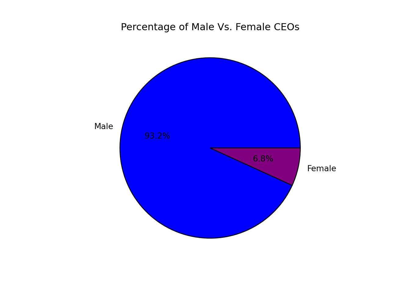 From the pie chart, it’s clear that only 6.8% of Fortune 1000 companies are led by female CEOs.
Next, I wanted to see which states have the most Fortune 1000 companies. I used the value_counts() method in Pandas to count the number of companies in each state, and then created a treemap using Squarify to visualize the results:
## (0.0, 100.0, 0.0, 100.0)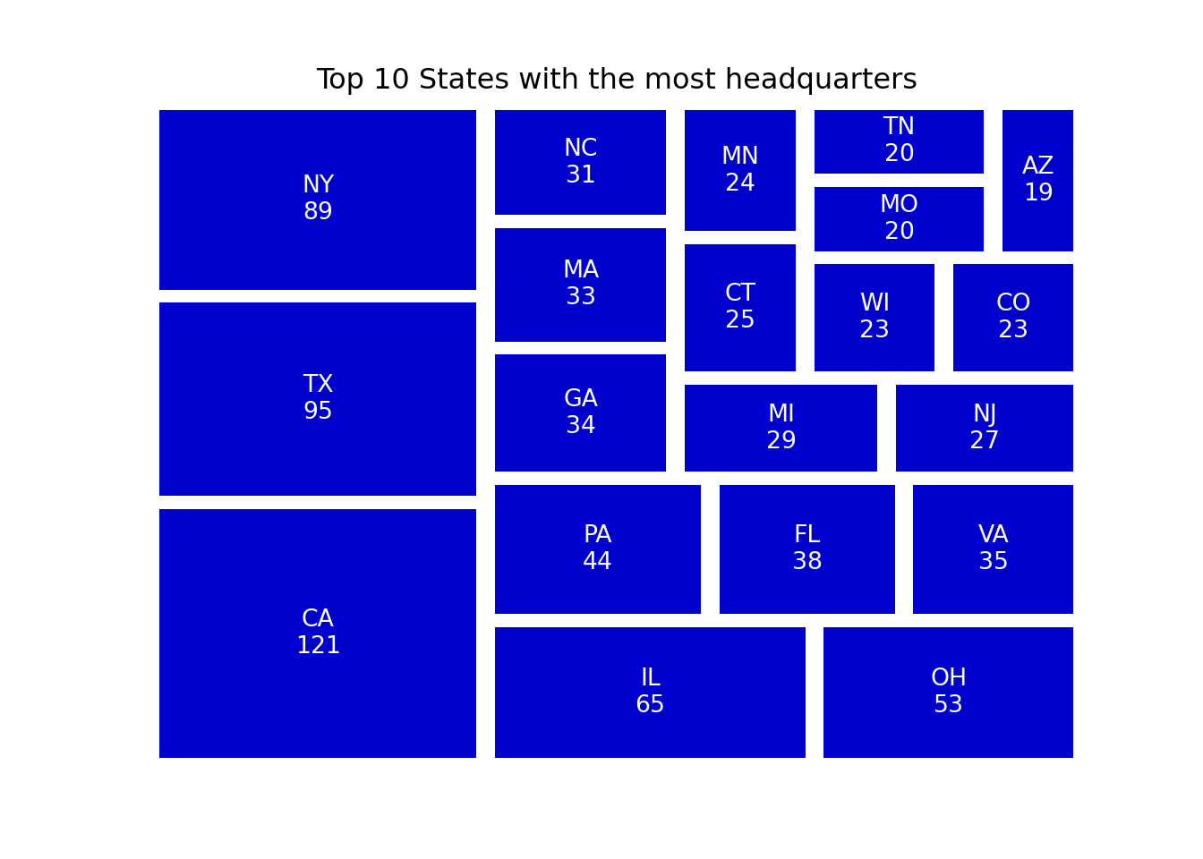 This code uses
 pandas and squarify libraries to create a treemap that shows the top 20 states with the most Fortune 1000 companies.
First, the code creates a DataFrame ‘state_count’ using the value_counts() method to count the number of times each state appears in the ‘state’ column of the original DataFrame ‘df’. The resulting DataFrame is then sorted in descending order using nlargest() function to get the top 20 states with the most companies.
The sizes and labels for the treemap are then created. The sizes variable is a list of the ‘counts’ column of the ‘state_count’ DataFrame, while the labels variable is a list comprehension that creates a string for each state and its count in the format ‘state’.
Finally, the squarify library is used to create the treemap. The sizes and labels variables are passed to the squarify.plot() method, along with a color map and an alpha value to adjust the opacity of the squares. The plt.axis() method is used to turn off the x and y axis labels and the title of the plot is set using plt.title(). The resulting treemap shows the states with the most Fortune 1000 companies in a visually appealing way.
To wrap up, let’s take a look at how we can compare profit and revenue in a bar plot. We can use this visual tool to gain insights into the performance of the top five Fortune 1000 companies. To achieve this, we melted the data to create a tidy format, then used Seaborn to create a clean and informative bar plot. Additionally, we created a table to show the percentage change in revenue to profit for each company.
# Profit vs. revenue in bar plot
rev_prof = df.nlargest(5,'revenue')
rev_prof = pd.melt(rev_prof,id_vars = ['company'],value_vars = ['revenue','profit'])
sns.set_theme(style="whitegrid")
sns.set_color_codes("pastel")
p1 =sns.barplot(x="value", y="company",hue = "variable",data= rev_prof)
p1.set_title("Profit Vs. Revenue for Top 5 Fortune 1000 Companies")
p1.set(xlabel='Millions ($)', ylabel="")

# Make table to put next to plot to show percent change in rev to prof
df2 = df.nlargest(5,'revenue')
#define custom function
def find_change(df2):
    change = (df2['profit']/df2['revenue'])*100
    return(change)
df3 = df2.groupby('company').apply(find_change).reset_index()
df3=df3.round()
#per_change = rev_prof.groupby('company','variable','value').assign(percent_change = (''))
# Put barplot and table together in same plot

plt.subplots_adjust(left=0.2, bottom=0.4)

the_table = plt.table(cellText=df3.values,
          cellLoc = 'center', rowLoc = 'center',
          transform=plt.gcf().transFigure,
          bbox = ([0.3, 0.1, 0.5, 0.2]))
the_table.auto_set_font_size(False)
the_table.set_fontsize(6)

plt.show()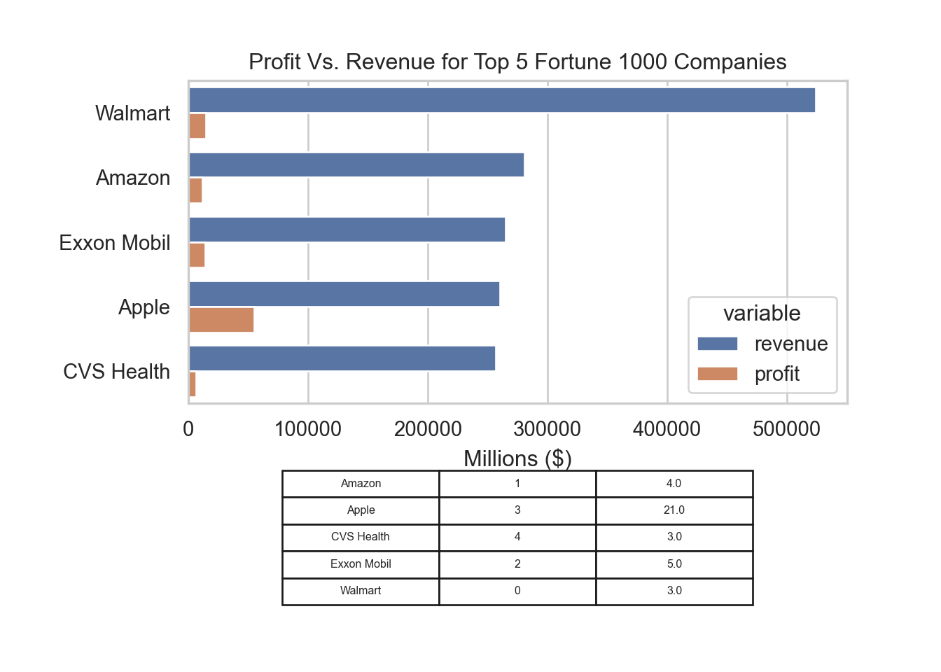
These are just a few examples of the many techniques available for EDA. If you want to dive deeper into this topic, I highly recommend checking out the Python Plot Gallery. It’s an excellent resource to explore the vast array of visualization tools available and discover new ways to gain insights from your data.